Implementing custom popups in SwiftUI
The article is now available on my blog:
https://www.artemnovichkov.com/blog/custom-popups-in-swiftui

Two months ago my friend @iamnalimov and I published jstnmbr app on ProductHunt. The idea of the app is very simple — count everything: books, push-ups, glasses of water. Of course, I choose SwiftUI for implementation. In this article, I want to highlight the key moments of implementing custom popups. It won't be in the tutorial format, we'll add a specific layout, but I hope it helps you in using overlays, geometry readers, and modifiers in your projects. If you have any questions or ideas on how to improve it, ping me on Twitter.
Design is the key
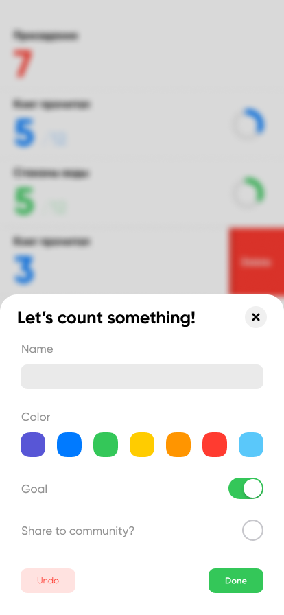
Let's start with the design. Popups may contain different content, but the appearance and behavior are the same. Superviews are covered with blur overlay, popups have the same background color, top left and right rounded corners, and ability to dismissing:
We want to implement a familiar API interface for presenting like alerts or action sheets:
.popup(isPresented: $isPresented) {
    popupView
}
Here we have a Binding<Bool> for presenting state and @ViewBuilder for popup content. Internally it will contain two parts:
- Custom
ViewModifierthat will show popups via overlays. - View extension for convenience interface and blur overlays.
Modifiers And View Extensions
Initially, we create OverlayModifier:
import SwiftUI

struct OverlayModifier<OverlayView: View>: ViewModifier {

    @Binding var isPresented: Bool
    @ViewBuilder var overlayView: () -> OverlayView

    init(isPresented: Binding<Bool>, @ViewBuilder overlayView: @escaping () -> OverlayView) {
        self._isPresented = isPresented
        self.overlayView = overlayView
    }
}
It contains isPresented state and the popup content. To conform ViewModifier protocol, we must implement body(content:) function. In our case it just optionally adds an overlay based on the state:
func body(content: Content) -> some View {
    content.overlay(isPresented ? overlayView() : nil)
}
Pay attention to overlayView(). Its body will be called only when popups is presented. View knows nothing about this modifier, so we extend View protocol with popup presentation:
extension View {

    func popup<OverlayView: View>(isPresented: Binding<Bool>,
                                  blurRadius: CGFloat = 3,
                                  blurAnimation: Animation? = .linear,
                                  @ViewBuilder overlayView: @escaping () -> OverlayView) -> some View {
        blur(radius: isPresented.wrappedValue ? blurRadius : 0)
            .animation(blurAnimation)
            .allowsHitTesting(!isPresented.wrappedValue)
            .modifier(OverlayModifier(isPresented: isPresented, overlayView: overlayView))
    }
}
Let's describe every modifier:
bluradds a blur overlay to superview if the popup is presented. We have a default value in function parameters to reuse the same radius and modify for specific popups if needed.animationadds an animation for blur overlay if needed.allowsHitTestingdisables user interactions in superview if the popup is presented.modifierapplies customOverlayModifierwith passedoverlayView.
We're ready to show popups, but we don't have any yet 😅. Let's make a basic PopupView with a common appearance according to our goals:
- It may contain different content inside;
- It has a background color and rounded top left and top right corners;
- It is showed from the bottom with animation.
Popup Layout
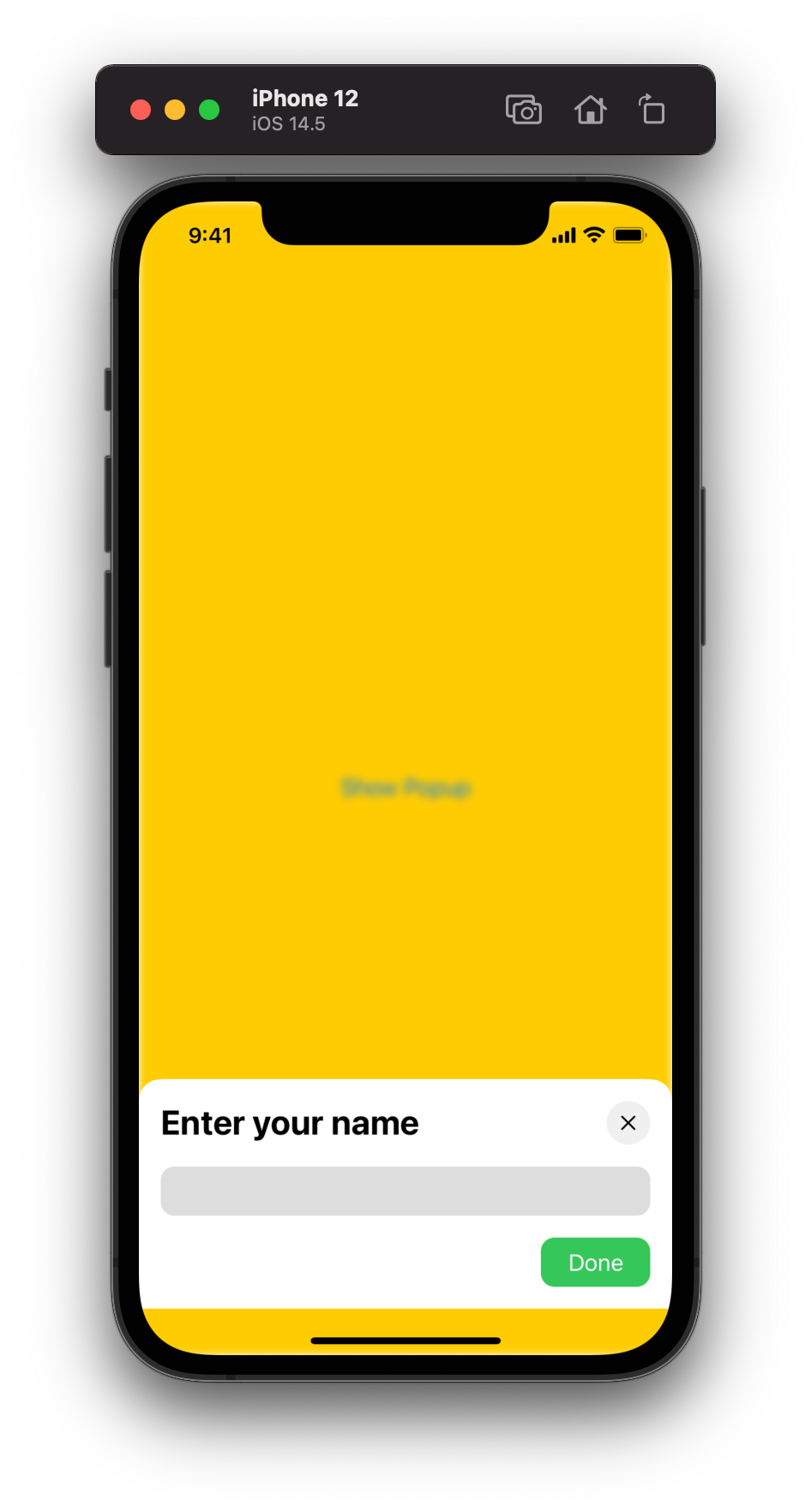
Let's create a simple view named NamePopupView that knows nothing about popup logic:

The app may show different popups, so we create a reusable BottomPopupView to show different content:
struct BottomPopupView<Content: View>: View {

    @ViewBuilder var content: () -> Content

    var body: some View {
        content()
    }
}
Now we can show it in .popup modifier:
.popup(isPresented: $isPresented) {
	BottomPopupView {
		NamePopupView(isPresented: $isPresented)
	}
}
By default, overlays are shown in the center of the superview. To pin it to the bottom we wrap the content into VStack with Spacer:
VStack {
	Spacer()
	content()
	    .background(Color.white)
	    .cornerRadius(radius: 16, corners: [.topLeft, .topRight])
}
Default cornerRadius modifier works for all corners, so here we use a custom modifier for it:
struct RoundedCornersShape: Shape {

    let radius: CGFloat
    let corners: UIRectCorner

    func path(in rect: CGRect) -> Path {
        let path = UIBezierPath(roundedRect: rect,
                                byRoundingCorners: corners,
                                cornerRadii: CGSize(width: radius, height: radius))
        return Path(path.cgPath)
    }
}

extension View {

    func cornerRadius(radius: CGFloat, corners: UIRectCorner = .allCorners) -> some View {
        clipShape(RoundedCornersShape(radius: radius, corners: corners))
    }
}
All is now ready, and here is the result:
Insets for Safe Area have added automatically, but we want to overlay superviews at the bottom too. To read and use Safe Area insets, we add GeometryReader:
GeometryReader { geometry in
	VStack {
	    Spacer()
	    content()
		    .padding(.bottom, geometry.safeAreaInsets.bottom)
		    .background(Color.white)
		    .cornerRadius(radius: 16, corners: [.topLeft, .topRight])
	}
	.edgesIgnoringSafeArea([.bottom])
}
To pin our popup at the bottom, we add .edgesIgnoringSafeArea modifier. According to the content, we add a bottom padding with the bottom inset before .background modifier. With this logic background color will appear as expected.
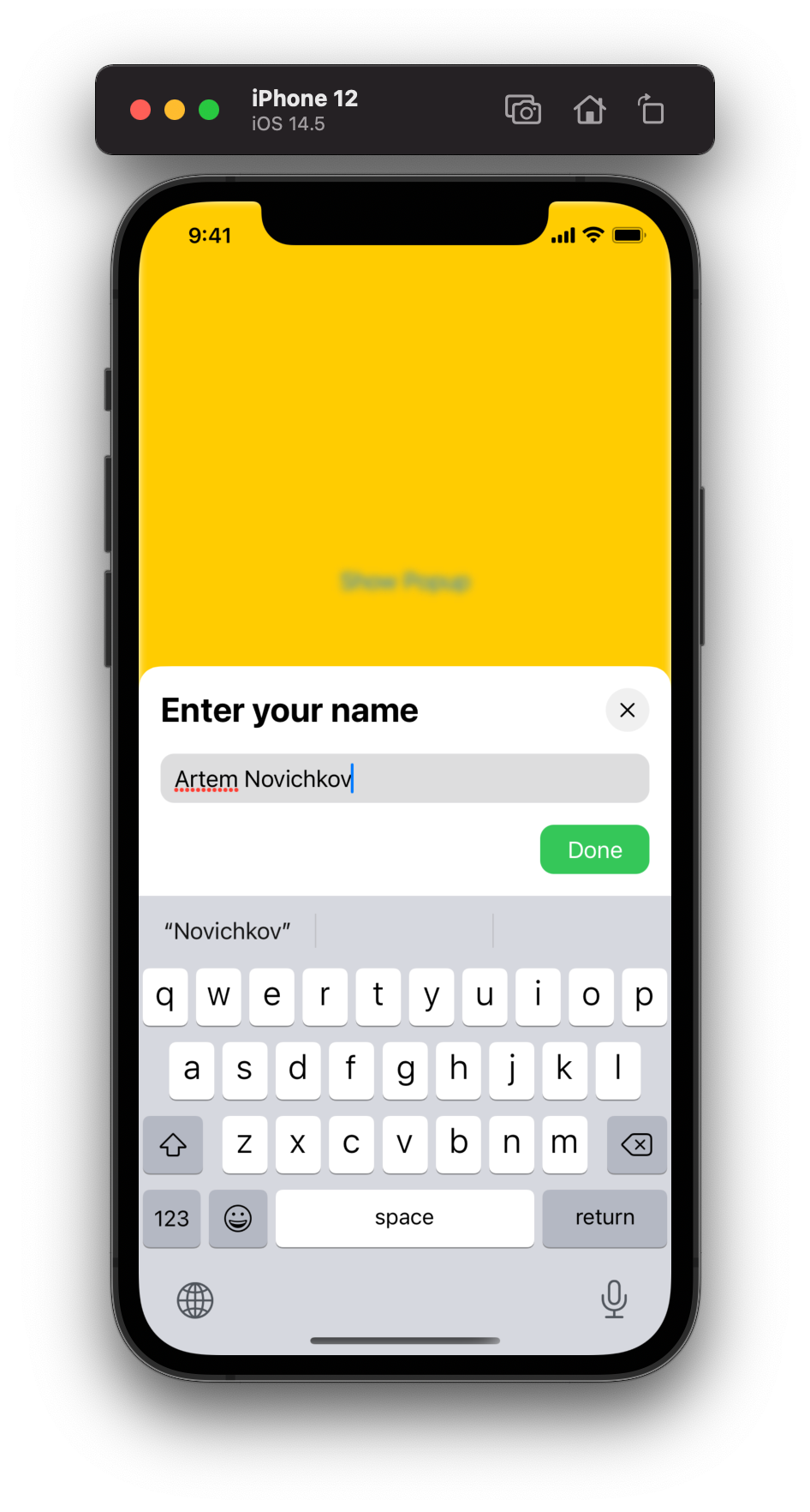
Since iOS 14 we even have an automatic keyboard avoidance:
Animations
The layout is finished 🥳, but there is no animation. Luckily SwiftUI has easy-to-use modifiers for animations and transitions:
GeometryReader { geometry in
    ...
}
.animation(.easeOut)
.transition(.move(edge: .bottom))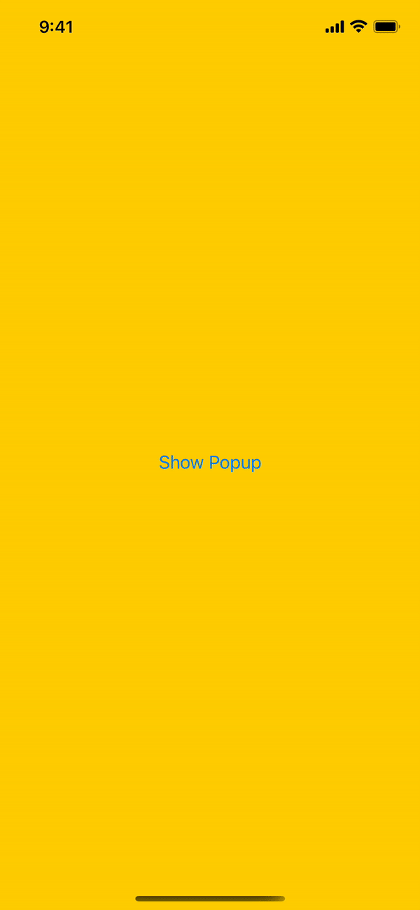
Source Code
You can find the final project on Github. Thanks for reading!
Related Articles
- Custom Popup in SwiftUI by Vadim Bulavin
- How to use GeometryReader without breaking SwiftUI layout by Majid Jabrayilov
- SwiftUI keyboard avoidance by Federico Zanetello